
VIOLA
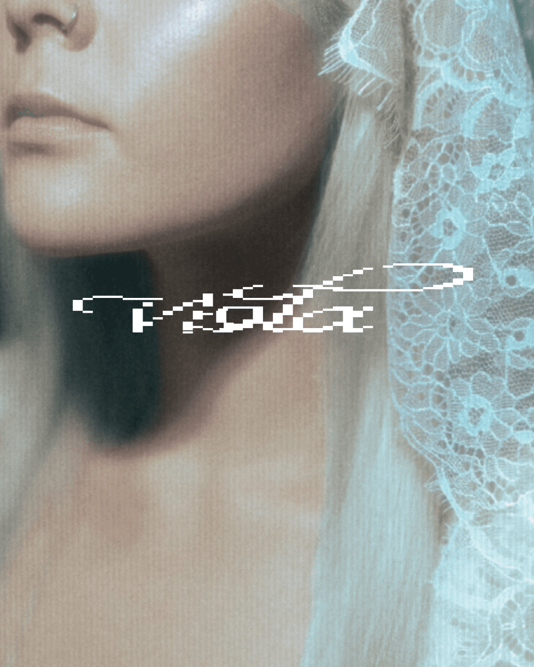
Art direction & brand identity — EP release 2026 For viola’s debut EP, I art directed the full visual world, from the first sketch of her identity to the last printed poster. The music set the tone for everything. I translated it into a look that is recognizable, true to her and built to grow with her. The result caught the attention of music industry professionals: record labels got in touch with viola, and the visuals stayed in their minds.
Art direction & brand identity — EP release 2026 For viola’s debut EP, I art directed the full visual world, from the first sketch of her identity to the last printed poster. The music set the tone for everything. I translated it into a look that is recognizable, true to her and built to grow with her. The result caught the attention of music industry professionals: record labels got in touch with viola, and the visuals stayed in their minds.
Art direction & brand identity — EP release 2026 For viola’s debut EP, I art directed the full visual world, from the first sketch of her identity to the last printed poster. The music set the tone for everything. I translated it into a look that is recognizable, true to her and built to grow with her. The result caught the attention of music industry professionals: record labels got in touch with viola, and the visuals stayed in their minds.
VIOLA
VISUAL WORLD FOR AN EMERGING INDIE ARTIST
EXECUTION
DIRECTION & DESIGN
Everything started from the sound. Before any visual decisions, I spent time with the EP and with viola herself, to understand who she is as an artist and what mood her materials should carry. The EP became the anchor for every choice of mood, color and type, and the aim was a visual language that feels like her and visualizes the world of the EP. I also studied how other independent artists promote themselves, both on social media and in physical formats, to see what stands out and what blends in. THE CHALLENGE with an artist at the start of her career is that there is no visual history to build on, so the identity has to feel like her from the first impression and still leave room to develop.


EXECUTION
The identity came to life across every touchpoint of the release. I designed and laid out the lyric booklet for print, and created the tour poster and the invitations for the listening event and a dance workshop. For the music video, I designed the title typography, credits and release dates, with readability in motion as the priority. Each piece was built to be recognized as part of the same world, and to work both in print and on screen. Printed extras such as the logo sticker and posters carried the brand into viola’s fans’ hands. Beyond the design, I helped plan the promo schedule and its content so visibility built up step by step toward the release. I also took part in organizing and running the listening event and filming behind-the-scenes materials to be used in post-promotion marketing. At the listening event, guests said the visuals captured the music and opened it up in a new way. This was a clear sign for me that I had succeeded in my work.
The identity came to life across every touchpoint of the release. I designed and laid out the lyric booklet for print, and created the tour poster and the invitations for the listening event and a dance workshop. For the music video, I designed the title typography, credits and release dates, with readability in motion as the priority. Each piece was built to be recognized as part of the same world, and to work both in print and on screen. Printed extras such as the logo sticker and posters carried the brand into viola’s fans’ hands. Beyond the design, I helped plan the promo schedule and its content so visibility built up step by step toward the release. I also took part in organizing and running the listening event and filming behind-the-scenes materials to be used in post-promotion marketing. At the listening event, guests said the visuals captured the music and opened it up in a new way. This was a clear sign for me that I had succeeded in my work.


Everything started from the sound. Before any visual decisions, I spent time with the EP and with viola herself, to understand who she is as an artist and what mood her materials should carry. The EP became the anchor for every choice of mood, color and type, and the aim was a visual language that feels like her and visualizes the world of the EP. I also studied how other independent artists promote themselves, both on social media and in physical formats, to see what stands out and what blends in. THE CHALLENGE with an artist at the start of her career is that there is no visual history to build on, so the identity has to feel like her from the first impression and still leave room to develop.
DIRECTION & DESIGN
COMISSIONS OPEN
FOR INQUIRIES, PLEASE CONTACT VIA EMAIL
CURATE@BERGBYBERG.COM